DESIGN
Analysis...
Design Justification
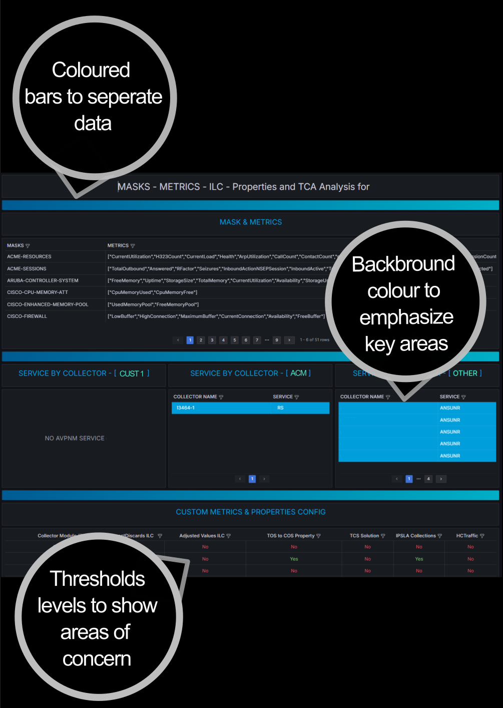
The challenge was to present data from multiple sources within a unified, intuitive view. To ensure clarity and ease of use, the information needed to be logically structured into distinct sections, allowing for seamless navigation and a consistent experience. Maintaining simplicity was crucial—if the interface became cumbersome or time-consuming, users might abandon it in favor of their previous, less efficient methods of accessing data. By prioritizing organization, accessibility, and consistency, the design aimed to encourage adoption and improve overall user experience.
Fig 1. M&R page
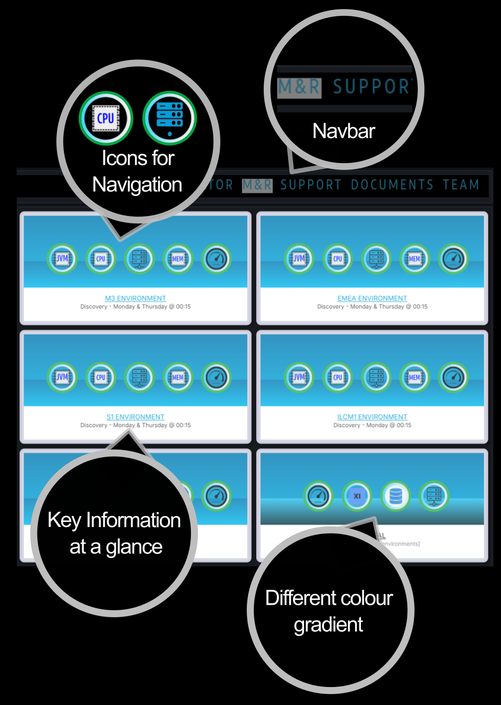
Fig 2. Orchestrator page
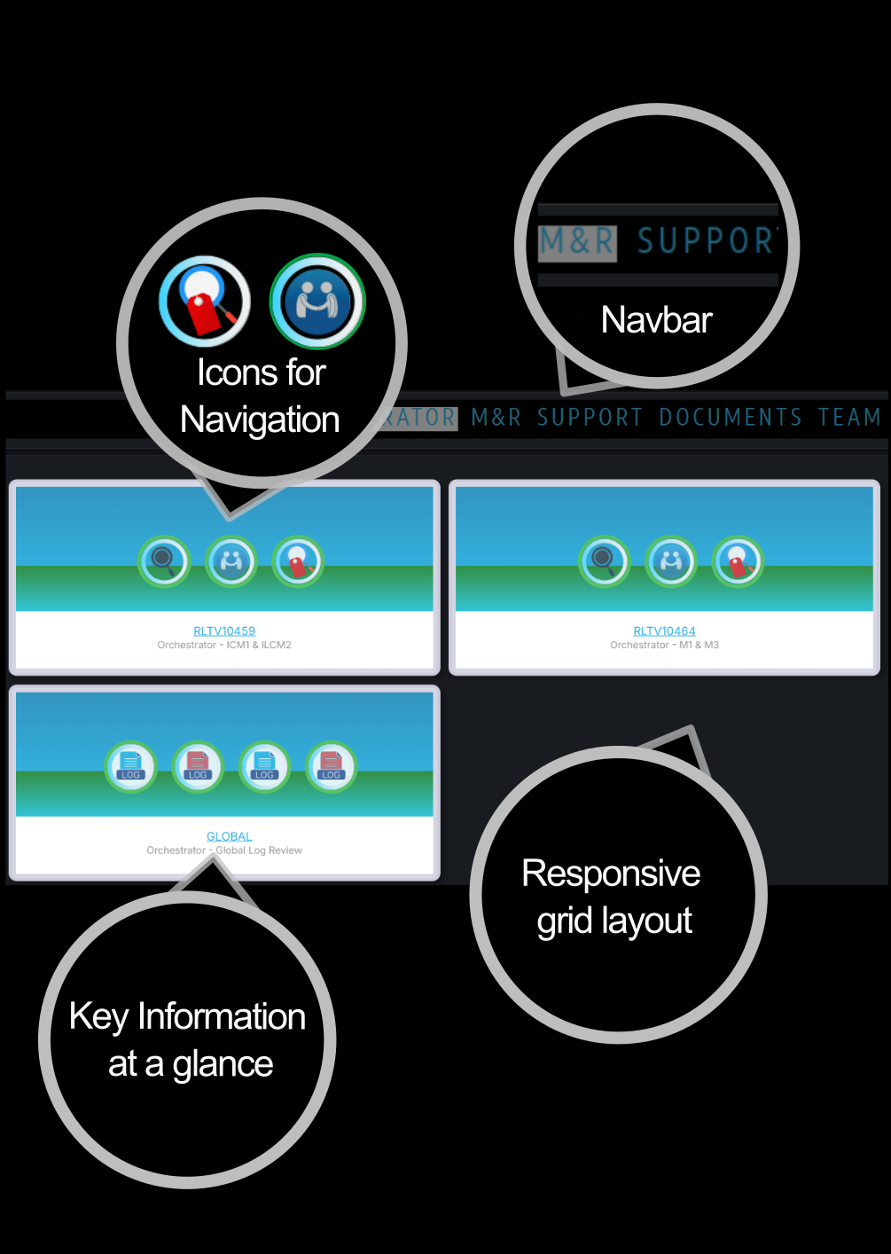
Fig 3. Icon drill down